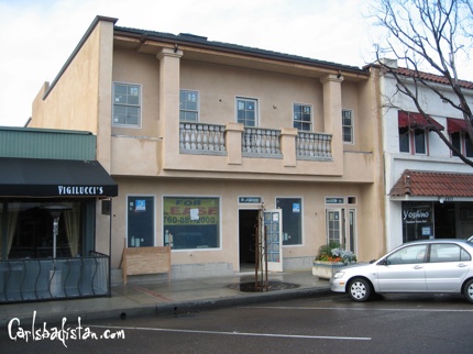
The new building on State street was under construction a little too early to “benefit” from the City of Carlsbad’s “revised master plan,” so I really don’t know who is to blame for this Village eyesore. When the foundations were being laid I was excited to see what the new face of Carlsbad Village building design would look like. Now that it is completed, I see that the new face of Carlsbad Village is: Tijuana Tuscany. (Sadly, after researching the Tijuana pharmacies this new building reminded me of I discovered that most of them have a more pleasing aesthetic).
So, what is wrong with this structure? Well, from a retail perspective the windows are much too small, not to mention that they look like they were purchased at a Home Depot remnant sale. This probably has more to do with they way they are positioned on the front of the building. There appears to be no consistency or balance to the placement of the windows. And then, of course, there is the burnt salmon color.
While it is nice to see new buildings in the Village, it’s disappointing when they look like this.

An astute observation…good read!
It is a shame they put this tacky-looking architecture next to one of the oldest and most historic buildings in Carlsbad. No wonder no one is leasing it! Good description — TJ Tuscany lol!
0cq2ijubw6i9k048
Did you proofread your column before publishing it? While I really agree with your article, the numerous mistakes that you have made take away from taking your story seriously. It really is a shame because you have many valid points concerning this eyesore of a building. Next time take the extra five minutes to go over what you have written and make sure that there are not any typos.
Keep up the good work of informing fellow citizens of Carlsbad with events and observations concerning our city. You really are doing a good job despite the mistakes in your story.
Comments on this entry are closed.