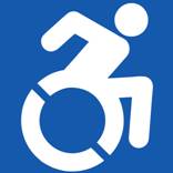
 Apparently, the wheelchair crew didn’t like the old accessibility logo that showed a stick man sitting back, lax, in an old-school wheelchair. With all the challenged athletes out there rolling marathons, racing on mountain bike courses, and doing all the things everyone else does, the crew at the Accessible Icon Project decided it was time to update that old, 1968 style logo with a new one that better represented the way people use wheelchairs these days.
The staff at Tri-City Medical Center decided they agreed and became the first facility in the state of California to update all their signage.
“The old symbol no longer accurately depicts the extraordinary people in our community who use wheelchairs,” said Casey Fatch, interim CEO of Tri-City Medical Center. “This new icon is the future – and we thought it was up to the medical community to lead on this issue. This new icon reflects Tri-City’s commitment to treating our patients with caring, dignity, kindness and respect.”
For the official word from Tri-City Medical Center, follow the jump. [click to continue…]
{ Comments on this entry are closed }




 RSS Feed-Posts