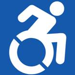
 Apparently, the wheelchair crew didn’t like the old accessibility logo that showed a stick man sitting back, lax, in an old-school wheelchair. With all the challenged athletes out there rolling marathons, racing on mountain bike courses, and doing all the things everyone else does, the crew at the Accessible Icon Project decided it was time to update that old, 1968 style logo with a new one that better represented the way people use wheelchairs these days.
The staff at Tri-City Medical Center decided they agreed and became the first facility in the state of California to update all their signage.
“The old symbol no longer accurately depicts the extraordinary people in our community who use wheelchairs,” said Casey Fatch, interim CEO of Tri-City Medical Center. “This new icon is the future – and we thought it was up to the medical community to lead on this issue. This new icon reflects Tri-City’s commitment to treating our patients with caring, dignity, kindness and respect.”
For the official word from Tri-City Medical Center, follow the jump.Tri-City Medical Center Rolls Out New Accessible Icon
Tri-City is the First Facility in California to Adopt the New Symbol
<image001.jpg>Oceanside, Calif.; March 8, 2014 – Scaling glaciers, skiing cliffs, ripping the surf and competing in triathlons are physical challenges for any athlete, but Cardiff resident and extreme sports athlete Jeremy McGhee tackles them all without the use of his legs. Partially paralyzed after an accident in 2001, Jeremy, like many of today’s wounded warriors, is helping redefine society’s attitudes about accessibility.
Today, Tri-City Medical Center, in partnership with Clarks Americas, joined forces with McGhee to become the first facility in the state of California to adopt a new icon for handicapped accessibility.
The Accessible Icon Project is a global movement to transform the old International Symbol of Access into a new active, engaged image.
Tri-City Healthcare District Board of Directors, the mayors of Oceanside and Vista, Tri-City Medical Center leadership, doctors, staff and others from the community repainted 50 handicap parking spots at the Hospital’s main campus at 4002 Vista Way.
“The old symbol no longer accurately depicts the extraordinary people in our community who use wheelchairs,” said Casey Fatch, interim CEO of Tri-City Medical Center. “This new icon is the future – and we thought it was up to the medical community to lead on this issue. This new icon reflects Tri-City’s commitment to treating our patients with caring, dignity, kindness and respect.”
The Accessible Icon Project founders Sara Hendren and Brian Glenney, PhD sought to update the old image, which was created in 1968, to change how people with disabilities are perceived. The old icon is passive and static. Its arms and legs are drawn like mechanical parts, its posture is unnaturally erect, and it puts the chair first, not the person. Conversely, the new icon represents activity and forward momentum. For more information on the Accessible Icon Project, visit http://www.accessibleicon.org/.
About Tri-City Medical Center
Tri-City Medical Center has served its community for more than half a century and is a Gold Seal-approved full service, acute-care hospital with two advanced institutes and over 500 physicians practicing in 60 specialties. Tri-City Medical Center has become the county’s leader in robotic and minimally invasive surgical technologies, including being the exclusive county-wide provider for the Mazor Renaissance Surgical Guidance System for surgical repair of spinal deformities, injuries and rehabilitation. Tri-City Medical Center also has the only Level III Neonatal Intensive Care Unit in North San Diego County, now with the NICView System, a password-protected webcam system that allows parents and relatives to remotely view their newest family member.